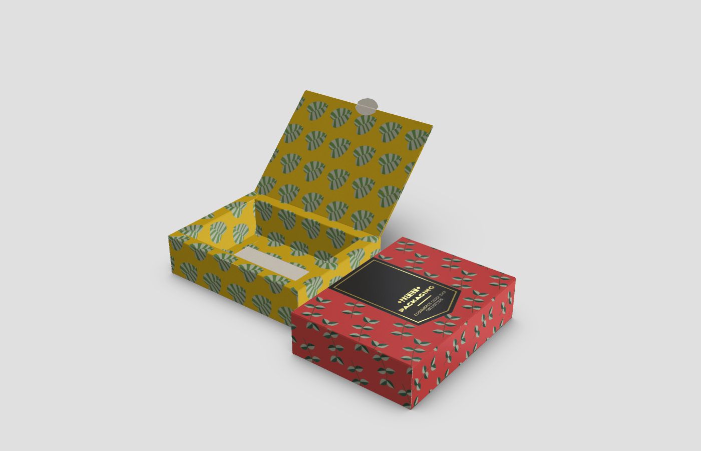
The first few weeks of the new year is the perfect time to start thinking about making some major branding changes to revamp your image. Fresh off the holiday buzz, consumers are ready to also start shaking things up a little as they dust off the remnants of the previous year and look forward to new beginnings.
Magenta Depot is taking part in the latest custom-printed packaging trends for 2022 to help businesses seamlessly transition into the next phase of their marketing strategies.
Here are some of our top custom-printed packaging design ideas to help you start the new year off on the right foot and make a lasting impression on your customers.
Calm and Serene Designs
The pandemic is far from over. During these particularly trying times, consumers are turning to their favourite brands for a sense of calm, serenity, and solace. Now, more than ever, people are seeking out comfort and escapism in their favourite products. Minimalist packaging with muted tones and simple designs are a great source of comfort for a lot of people.
Edgy Faux 3D Illustrations
Faux 3D designs give an additional layer of visual texture to your custom-printed packaging that truly makes it pop. The illusion of texture consisting of wavy designs and patterns gives your custom-printed packaging a unique twist that makes it instantly recognizable and sets you apart from your competitors.
Instagram-Inspired Colour Mists
Instagram is home to a number of fashion and trend influencers. Tessa Forrest is just one of many, but her unique colour mist product packaging designs have taken on a life of their own on the major social media platform.
These seemingly simplistic packaging designs that display a splash of colour that looks like its been spray painted onto an otherwise plain white background are equally visually appealing, calming, and eye-catching. We predict that this is one custom-printed packaging trend that will continue to make waves in 2022 and beyond.
Combining Minimalism with Maximalism
The early 2000s brought on a unique design era for product packaging. Designers were more eager to use funky, futuristic, and bold colours and patterns to illustrate their branded packaging. The 2020s flipped all of that on its head by taking a more simplistic and elegant approach to product packaging design.
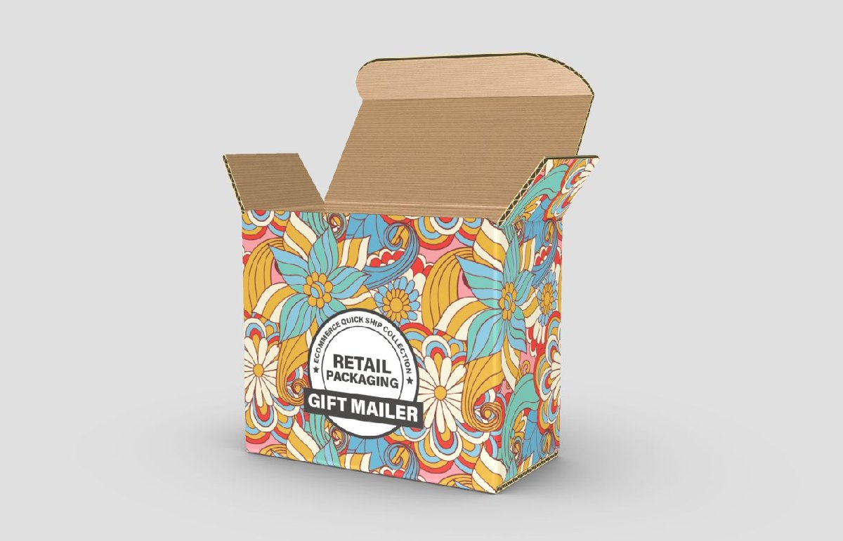
Like most trends, things have come full circle and product packaging designers are combining the best of both maximalism and minimalism to appeal to larger demographics of consumers. A mixture of soft, pale neon tones and brash unmistakable patterns are adorning modern packaging to draw the attention of consumers and entice them to purchase products that instill a simultaneous feeling of nostalgia and futuristic optimism.
Earthy Designs for Eco-Friendly Brands
Eco-friendly brands tend to lean toward more earthy or neutral tones such as beige, white, brown, and army green in their designs. These colours and design patterns inherently elicit a sense of environmental consciousness in the minds of consumers, which is why many of them are automatically drawn to this type of packaging.
It signals consumers that these brands care about the environment and that they’re taking steps to diminish their carbon footprints. Usually, this type of packaging is composed of biodegradable or recyclable materials that won’t take up space in landfills.
Localized Illustrations and Patterns
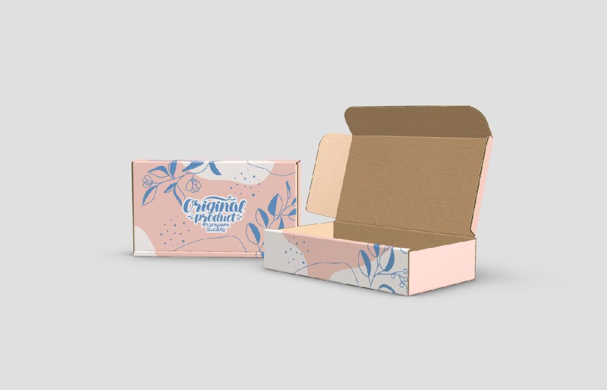
Visually appealing product packaging has the power to attract and hold the attention of consumers. Including stunning localized illustrations that feature colours and images that aptly represent your brand is an effective way to make a lasting impression on consumers before they even unbox and use your product. Images on product packaging do so much more than just fill an empty space; they have the power to evoke certain emotions and convey your brand’s history by displaying unique visual concepts.
Interactive Packaging
Modern technological advancements have opened up the doors for a variety of innovative interactive custom-printed packaging options that make the process of purchasing a new product a lot more interesting. Nowadays, product packaging is so much more than simply a temporary vessel to house items until they’re opened by consumers.
Product packaging can consist of special QR codes that open up webpages where consumers can learn more about the products they’ve purchased. Other examples of interactive product packaging include dual-purpose packaging that can be repurposed, reshaped, and reused. An example of this is the collapsible wine box and coffee bags that can be drawn on.
Vintage Old-World Packaging
Vintage product packaging designs like glass containers, cursive text, and paper bags are making a major comeback this year. Something about these charming 1950s-inspired designs reminds people of simpler times, even if they didn’t necessarily experience the beloved time periods of yesteryear. There’s a lot to be said for playing up the nostalgia factor when it comes to your custom-printed packaging designs, so this is definitely a growing trend to watch out for in the new year.
Vivid Gradients
Vivid gradients are similar to the aforementioned colour mist designs that are currently breaking the internet. This is a visually stunning design concept that incorporates different shades of the same colours on branded packaging to create an interesting and attention-grabbing bold appearance. For an even more stunning and unique visual effect, bold colours can serve as the backdrop for a unique product image to make it stand out even more.
Large Modern Fonts
Font is one of the most important and practical aspects of modern custom-printed packaging design. Yet, it often gets overlooked. In the past, brands would use difficult-to-read or completely illegible cursive fonts on their packaging, rendering it ineffective.
Consumers need to be able to easily read and recognize the text on your packaging so they can understand what it is you’re selling and make sure they have the right product. Illegible cursive fonts on product packaging are now considered a major advertising faux pas and are swiftly being traded in for larger fonts that are easier to read from far away.
Get the Magenta Advantage with Custom-Printed Packaging in Toronto
What exactly is the Magenta Advantage? We’re glad you asked. Magenta Depot is a leading supplier of custom-printed packaging in Toronto and the GTA. SMBs that order their unique short or long-run custom-printed packaging from us get the following advantages:
- Canadian-made products
- Fast and reliable two-week turnaround
- No setup fees
- 24/7 easy access to our online ordering platform
- Simplified design process using customized die lines
- Low minimum orders accepted
Contact us today to learn more or to place an order!

